One UI 8.5 is a hit, but a lot of you aren't happy with one element
हिंदी में सुनें
Listen to this article in Hindi
Samsung's One UI 8.5 beta is receiving mixed reactions. While many users like the update, a significant portion dislikes its iOS-inspired design.
Samsung's One UI has long distinguished itself with a unique identity within the Android ecosystem. Unlike other Android skins, it has maintained a distinctly "Samsung" look and feel. That said, the reality is a bit more complicated. with the release of the One UI 8.5 beta, that unique identity seems to be evolving, sparking debate among users.
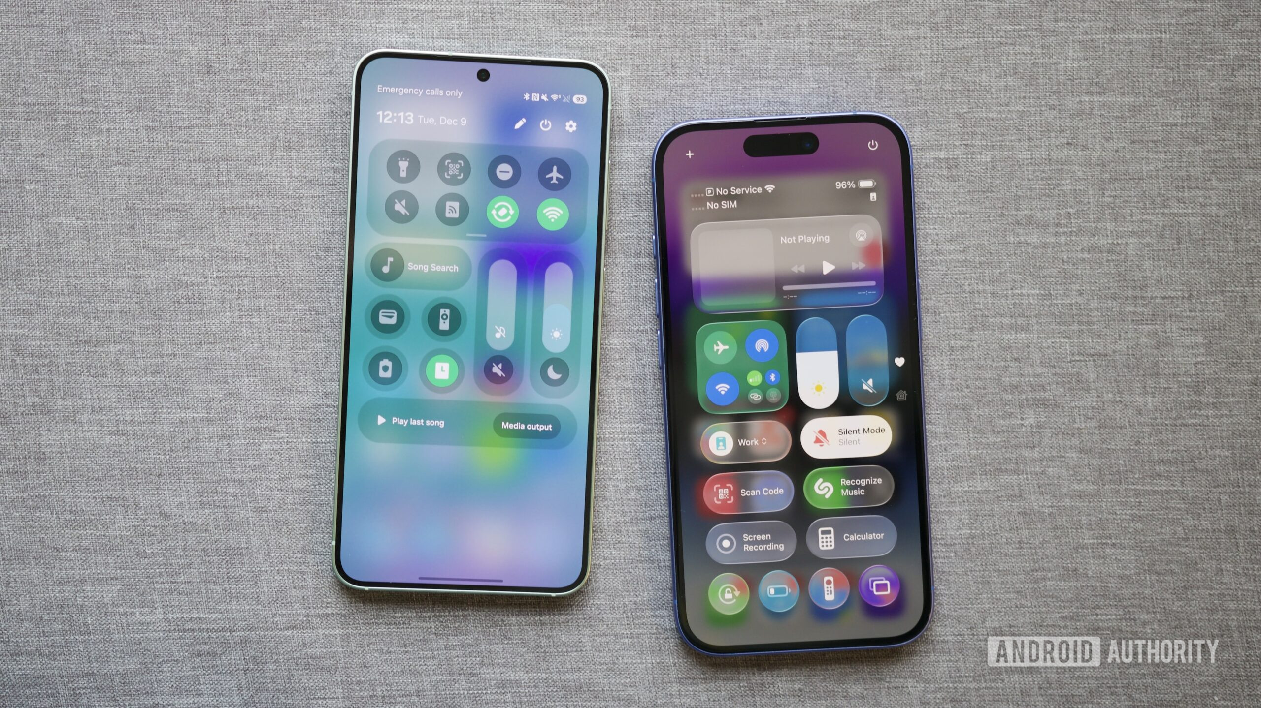
According to a recent opinion piece, the One UI 8.5 update might represent a step too far in Samsung's design evolution. The article highlighted changes such as the new Quick Settings layout and updated Samsung apps, noting their resemblance to iOS 26's Control Center and navigation bars. While the update offers customization options and a polished feel, the core question is whether these refinements are starting to mimic Apple's design too closely. This question prompted a reader poll to gauge user sentiment regarding the iOS-like changes in One UI 8.5.
The poll results, along with comments, revealed divided opinions.
User Sentiment on iOS-Like Changes
The poll results indicated a more negative than positive overall reaction. Over 42% of respondents expressed strong disapproval, stating they dislike the iOS-like changes and prefer their Android phone to maintain a distinct look. An additional 9% found the changes somewhat annoying, bringing the total to just over half of respondents who are unhappy with the new design direction. This seems to validate concerns that the update is shifting too far towards an iOS aesthetic.
That said, the reality is a bit more complicated. not all feedback was negative. Around 28% of readers responded favorably, indicating that they appreciate the changes. Approximately 20% expressed indifference, suggesting that the visual shift does not significantly impact their overall impression of One UI 8.5.
The comments section echoed the poll's divided sentiment. Many commenters agreed with the criticism, emphasizing that they chose Samsung and Android specifically for their divergence from iOS. These users found the iOS-inspired elements unnecessary and even off-putting. Some even suggested they might consider using third-party launchers or switching to other brands if this trend continues.
Conversely, many commenters defended the update. Some argued that the similarities are overstated, noting the limited design possibilities for basic apps like the Phone, Clock, and Calculator. Others pointed out that Apple has also adopted elements from Android over time. A common argument among supporters was the importance of customization: as long as One UI remains functional and adaptable, visual similarities are not a major concern. Some even welcomed the changes, suggesting they could ease transitions between platforms.
It's important to note that the poll focused specifically on the visual design of One UI 8.5 beta. A separate poll assessed user satisfaction with the update's functionality more broadly.
Overall Satisfaction with One UI 8.5 Beta
Readers appear to be more satisfied with the overall functionality of One UI 8.5 than with its design. Nearly half of respondents indicated they loved the beta and considered it a great update, making it the most popular response. Another 20% felt it was good but could still be improved, suggesting a generally positive initial impression for most users. Only about 14% expressed some form of dissatisfaction with the update.
The contrasting results of these two polls are revealing. While many users dislike the increasing resemblance to Apple's design language, this dissatisfaction does not necessarily translate into a negative overall view of One UI 8.5. The results suggest that many users appreciate the update's features and customization options, even if they are not entirely pleased with the direction of Samsung's visual identity.